
Visual language is essential in the digital world, but is too much consistency bad?
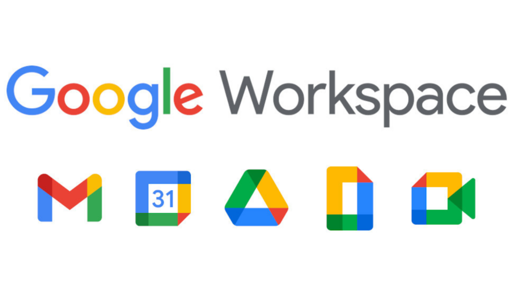
A significant change Google brought to users in 2020 is its updated brand identity. They have been updating their icons across Google Workspace throughout the year, and while this does not seem anything out of the ordinary, users became outspoken over how confusing the new icons are.
The new icons make it easy to tell what is a Google app and what is not. The problem people are having, however, is what Google app it is.
When asked about the change, the tech giant explained, “Our new Google Workspace brand reflects this more connected, helpful, and flexible experience and our icons will reflect the same.”
Google followed all the rules of brand design, so what went wrong for users?
Markus Hofmann wrote that what users are struggling with the most is how we use the icons. For example, icons typically are used to find the tab we are looking for quickly. Because of how users utilize icons, distinction is crucial.
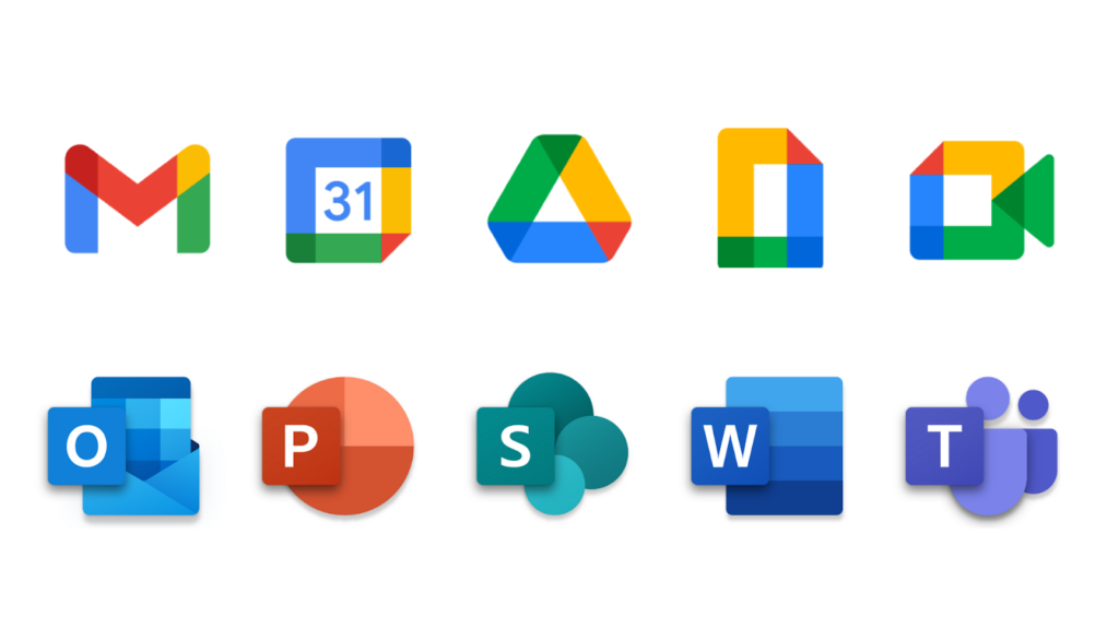
Firstly, Google shed single tones to adopt all the colors in the company’s color palette: red, blue, green, and yellow. Users complain about how there is no visual differentiation between them except for their shape. Even then, apps such as Google Docs and Meet look very similar in shape.
Good use of brand consistency that values distinction would be Microsoft Office. The icons for Word, Powerpoint, Excel, and Teams are all designed to look like Microsoft products, but users can tell them apart. Below, you can see the comparison between Google’s new icons and Microsoft Office’s icons.
When designing icons, it is crucial to create a distinction. Hofmann suggests that some ways you can do this are through:
- Shape & Proportions
- Colors
- Familiar Concepts
- Visual Style
A brand needs to have consistency and have a consistent visual style. Users, unfortunately, believe that Google missed the mark on their new rebranding.
Business professionals can take this opportunity to learn and reflect on the usability of their icons and avoid similar mistakes Google made in its rebranding. To learn about how to avoid other mistakes in branding, read our feature 5 Common Mistakes in Branding.
Sources:
https://www.creativebloq.com/news/switch-to-old-google-logos
https://medium.com/design-bootcamp/why-googles-new-app-icons-are-pretty-bad-10f1ec40ab0
https://sea.mashable.com/tech/13003/googles-new-icon-designs-are-consistent-but-the-internet-doesnt-think-so4
Does https://myrsvplive.com/drugs/levitra/ – myrsvplive work effectively for most men experiencing erectile dysfunction?