
The Do’s and Don’ts of Creating the Perfect Logo
In the world of modern marketing, logo design has the power to make or break a company. According to research conducted by Zippia, 60% of consumers will avoid a brand with a logo they find odd, ugly, or unappealing. Here are a couple Do’s and Don’ts of logo design to keep your brand at the top of its game.
DON’T: Select colors that clash with one another.
- Different colors, shades, and tones all convey different emotions. It’s important to avoid using two colors that carry two opposite moods. For example, you wouldn’t want to pair a calm, lavender purple background with bold, neon yellow text.
DO: Use an aesthetically pleasing color palettes/ colors that complement each other
- Color selection is crucial to the success of a logo. In a study conducted by Wellesley College, it was found that color is one of the first things perceived by our brains. Especially when selecting more than one color, you’ll want to make sure that each color compliments the other, and they work together in displaying the same tone. Canva’s complementary color tool is a great resource in logo color selection. https://www.canva.com/colors/color-wheel/
DON’T: Pick a font too simple or too abstract
- With the numerous font options available, picking a font for a logo can seem challenging. Narrow down the selection by filtering out overused fonts (comic sans, times new roman, etc.), and fonts that are so abstract that they’re unreadable.
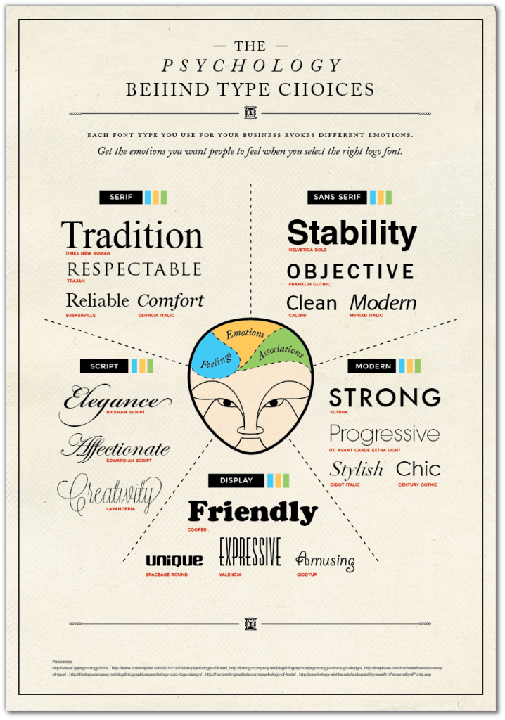
DO: Pick a unique font, but ensure that it’s not overused. Additionally, you’ll want to pick a font that conveys the tone that you want your logo to display. Similarly to color choices, font’s can express different emotions. Here is a diagram from logaster.com with further analysis on font psychology.
DON’T: Overcrowd your design, it is important to remember that less is more. If designed and marketed efficiently, a minimalistic design will be far more recognizable than a logo design that is crowded and busy.
DO: Keep it simple and make it memorable. One of the most successful logos ever created is the McDonalds logo. Although the design is a simple one, that yellow “M” with a red background was carefully designed to attract customers. According to Reader’s Digest, “Red and yellow makes you hungry, encouraging you to want to buy the product they sell, while also making you feel happy.”
Sources:
https://www.zippia.com/advice/logo-statistics/
https://www.sciencedaily.com/releases/2013/12/131219102759.htm
https://www.canva.com/colors/color-wheel/