
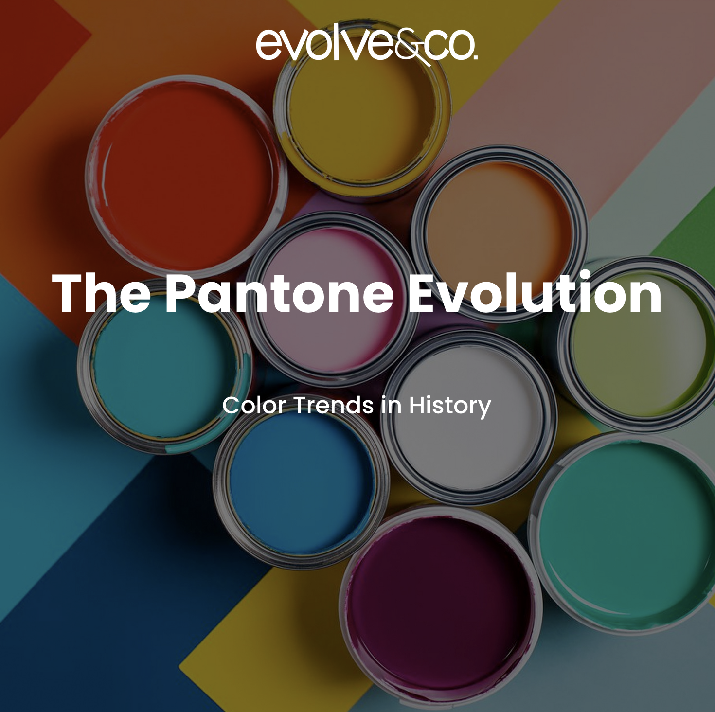
Painting Your Vision
There’s nothing like having a fresh paint job completed in your living room. Now that you’ve endured the process of deciding on the color of the year: considering the function, the vibe, the amount of natural light, etc., you’re ready to accessorize the room with a few accent colors (www.extraspace.com). Exploring the millions of colors available to you now that you are a painter can be overwhelming. However, not without the Pantone color matching system. The Pantone color matching system was created with Fashion designers, Graphic Designers, and Painters like you in mind (www.designface.com).
Historical Color Trends
Who knew that color would play a “huge” role in our lives? As color influences our emotions, memories, thoughts, and actions, it has always been a powerful tool when it comes to communication-farshor.com. Color could represent periods. For instance, decades- warm colors inspired the ’60s, cool-vibrant colors inspired the ’70s, and 80’s owned the bright cyans, reds, purples, yellows, you name it (juiceboxinteractive.com). Since color has had an impact on each decade, designers/show producers have intentionally taken note of color selections to innovate and intrigue. As the early 2000s was marked by culture and technical innovations, we have noticed how color took flight. For instance, iconic movies and tv shows such as Means Girls, High School Musical, That’s so Raven, etc., shared trending colors within that period: hot pinks, oranges, yellows, lime greens, and reds (juiceboxinteractive.com). The colors chosen within this time period, as you could tell, were more lively and interactive as the ideal audience were millennials.
![]()
What’s Poppin
We should also acknowledge fashion trends and how they were brought back in full rotation. For instance, the color black represented power and sophistication in the roaring ’20s, and was later brought back around by modern-day celebrities in black dresses, black vehicles, swayed, and more. In relation to the colors that inspired the early 2000s, we could see a connection in color choice with the 90s.The colors preferred in the 90s were similar to the 2000s, however, they were more muted and neutral (juiceboxinteractive.com).
Sources:
https://www.extraspace.com/blog/home-organization/how-to-choose-paint-colors-for-your-home/
https://www.pantone.com/about-pantone
https://www.designface.co.uk/pantone-articles/pantone-history/
https://www.farshore.com/blog/why-are-colors-so-important/
https://juiceboxinteractive.com/blog/color/
https://medium.com/@artteca/here-is-the-history-of-colors-in-fashion-and-culture-7f284cfea5f1
https://londonimageinstitute.com/how-to-empower-yourself-with-color-psychology/
https://www.realsimple.com/pantone-color-of-the-year-2023-6834526
trusted online pharmacy Victo Pharm top-rated online pharmacies
п»їfarmacia online espaГ±a: farmacia online barata y fiable – farmacia online barata y fiable
Quit spending a fortune and start ordering from п»їhttps://nathealth.casa/# right away.