
These Vintage Ads Will Take You Back in Time
In today’s generation, we have become more spoiled with the amount and variety of candy we can choose from. Candy corn has been the most common Halloween candy that can be traced back to the 1880’s. Now we have options like Reese’s, KitKats, Snickers, Starburst, and many more.
Not only did the candy itself change with the times, so did the advertisements. Back in the 1940’s and 1950’s, ads were less vibrant than those of today. They also have a bit more of a creepy tone to them. How the figures are drawn have a big impact on the ad and back then, it may have worked, but today illustrations are more cartoon instead of realistic. Today’s ads also contain more informal tone because they have more puns and jokes, whereas older ads mainly use facts or slogans in theirs.
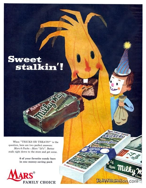
In a Milky Way ad, viewers can see a tree eating a Milky Way with a child peeking out from behind wearing a party hat and clown mask. It has dull colors which makes it noticeable as a vintage advertisement. Something about this ad gives an unsettling feeling. It probably worked as a “cute” image, but compared to today’s ads where they look more realistic and have a simple, vibrant design.
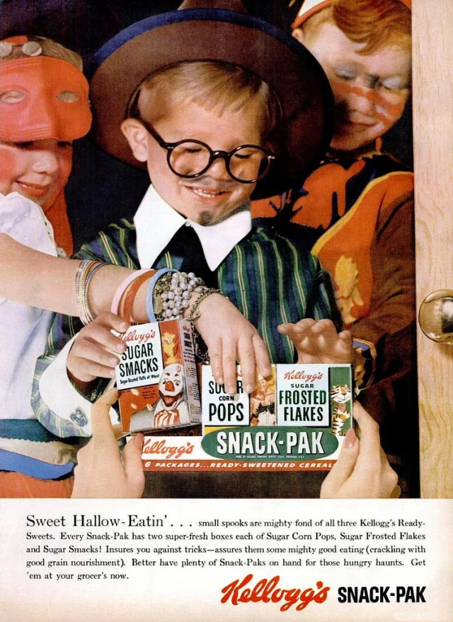
Kellogg’s surprisingly has had Halloween ads for all the kids who wanted a small box of cereal for Halloween. It is hard deciding what is creepier about this ad: the clown on the cereal box, or not knowing if the picture is a photograph or too realistic of a painting/drawing. Now, they have stuck with having the cereal boxes have a “spooky” twist without scary clowns on them.
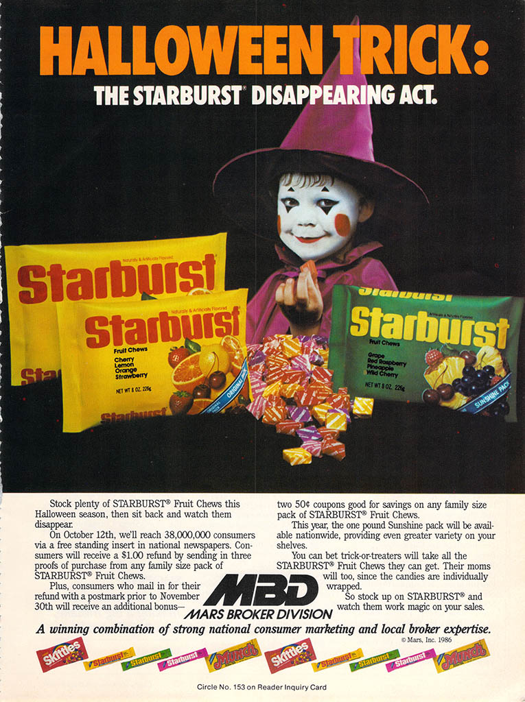
Starburst has one of the creepiest ads to date. Not only does a little girl seem to be staring into your soul, she is dressed as a clown/witch. And the use of a dark background so she sticks out even more does not help. Now, the company uses more cartoon based images, which can hopefully prevent less nightmares in young kids that would see it.

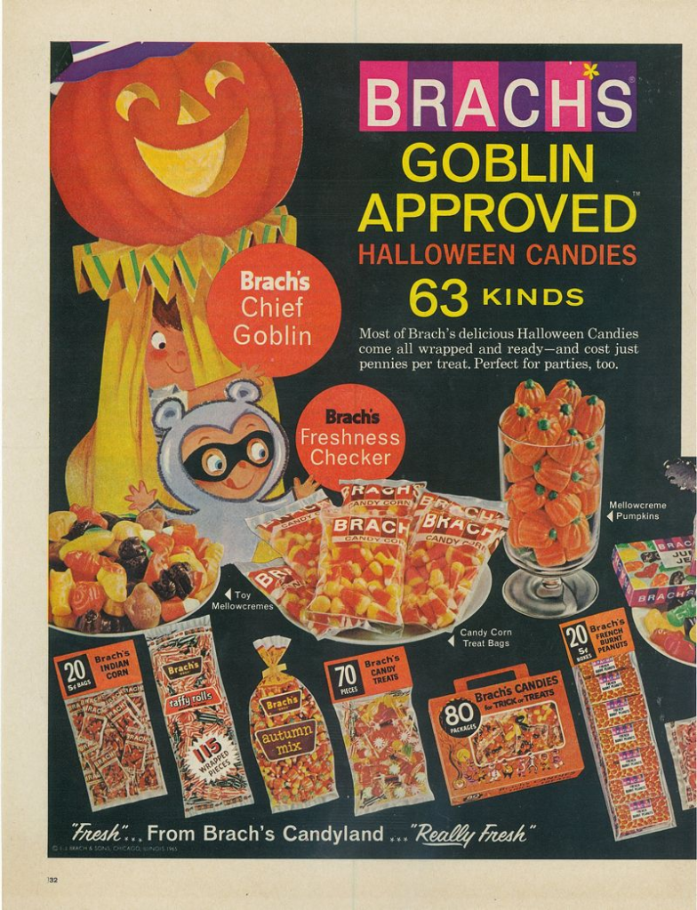
Brach’s is the most well-known holiday candy brand. They are the main distributor of candy corn for Halloween. This ad is less creepy than others and has the more vibrant colors that you might see in today’s advertisements. They went for a cuter image to show more of all the kinds of candy they offer. Today, they have just modernized their logo, font, and images they use.
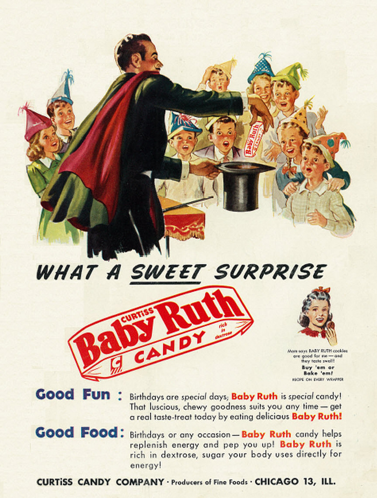
Baby Ruth focuses on a different approach for one of their ads. Instead of mainly focusing on the image they made, it only takes up half the page and the rest is filled with text. The too realistic of people is noticeable, but filling the bottom of the poster with text draws the viewer’s eyes to read it. It all pops off the page because of the off-white background.
As time has gone on, advertisements have become simpler. With quick access to everything and always being on a phone, tablet, or computer, ads can go unnoticed and especially if there is too much going on in one small picture. So, it is probably the best thing that ads have changed from a nightmare image on paper to simple design on a phone.
online pharmacy india and indian pharmacy paypal reputable indian pharmacies
https://www.keemp.ru/redirect.php?url=https://lifeaccesspharm.com:: Online medicine order and https://mantiseye.com/community/jtmizkcanz best online pharmacy india
reputable indian online pharmacy online pharmacy india or india pharmacy best india pharmacy