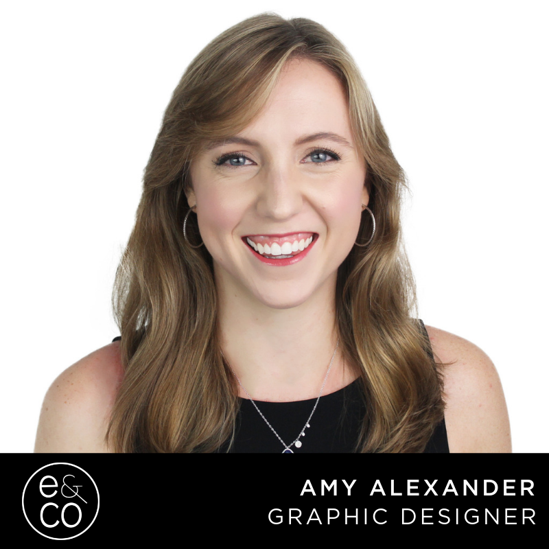
Amy is a recent U.S. citizen, originating from Scotland. She studied Leadership and Psychology at University of Richmond Virginia and loves event planning, graphic design, photography, and film production. Her interests are vast including fashion, snow skiing, cooking, video games, and crafting. She’s (her words) obsessed with orcas, and has seen the documentary ‘Blackfish’ at least 8 times. At Evolve & Co, Amy’s a creative powerhouse.
Where do you find design inspiration?
I find design inspiration in multiple places. Contrary to most people, I love commercials and ads. They are so creative and have a lot of design elements that I draw inspiration from. I also follow graphic designers, calligraphers, and bakeries on social media, all of which have different styles and creative philosophies.
What brands inspire you most and why?
I love Publix, Allstate, Drunk Elephant, Chipotle, and Apple to name a few. All of these brands inspire me for different reasons. Publix and Chipotle have great social medias and they’re constantly using different rich media. Allstate has created a very distinct brand identity with their commercials. Drunk Elephant is a cosmetics company that has a simple, yet recognizable look. Apple has always been a favorite of mine for inspiration. They refuse to compromise on design and have great attention to detail.
What is the most memorable project/ campaign you’ve worked on?
It is hard to choose just one campaign that I have worked on. I would have to say either Friendsgiving or the Snapchat lens, both for Crafty Squirrel. Friendsgiving was interesting to design because they asked for a vintage design with some flare. It was fun to research vintage photos and create a vintage feel with modern elements. I created a Snapchat lens for Crafty Squirrel’s CarnEVIL event. It was great to learn how to use Lens Studio and create something unique.
How would you describe your design style?
I would say that my design style definitely changes. If I was designing something for myself it would have clean lines, negative space, and bright colors. However when I am designing for clients I try to come up with unique ideas and love to use black and white photos to make other elements pop.

